To continue on from the Logos Section (1) and to
wrap up the Graphics for the Weekly Impact shows, I'm going to tackle the
visuals for the main Title Sequence to open up the show.
So putting some Storyboard action into play,
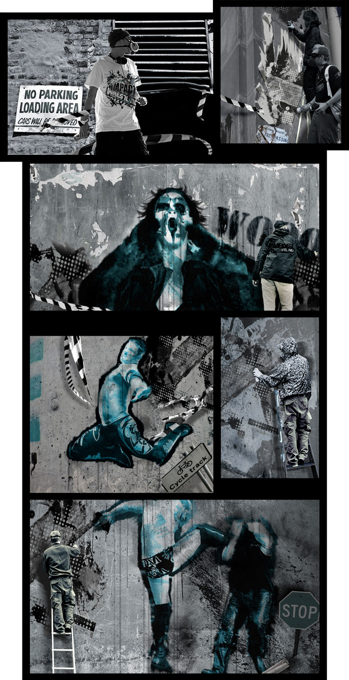
I've put together a set of photo panels to illustrate how the sequence will
run.
Now looking through the opening titles to most
Wrestling shows (past or present), apart from the music and logos standing out,
the sequences usually consists of cropped footage of characters, moves and
slams, cut together at a fast pace, with a few explosions in for good
measure.
And while this does its job in presenting the
contents to the show, I wanted to add a level of design to make the visuals
really stand out and give the show an identity that would be memorable and
instantly recognisable.
So in order to attempt in capturing the feel of
Impact and its target demography, and to make Impact look fresh, exciting and in
touch with its audience, I've produced a Title scenario that fits together
all the Logos, Colour Schemes and Props, while still keeping the clips of the
actual show’s events.
Titles with Style
Ok,so the basic premise is as follows:
A gang of street Artists, laden with spray cans
and paint, take to the outer walls of the Impact Zone. They set to work
spraying, tagging and fly-posting the entire area with giant-sized Wrestlers
and Logos, while the paintings begin to come to life as they work. The huge
characters move into action, smashing, grappling and slamming each other and
everything in sight as the area becomes a stomping ground of wrestling action.
As the gang work on regardless, the whole scene comes together, revealing the
huge action packed TNA Impact Wrestling logo.
Title Mechanics
To begin this, I’d have the gang breaking thru
the black and white tape (theme continuation from logo), then have them sped up
in super fast motion as they put the characters together at breakneck speeds.
The paintings would then interact with foreground objects, knocking over cans
and ladders, bending signposts and cutting through tape, whilst playing out
actual scenarios from clips of the show; Poses, Celebrations and high-impact
Moves.
So take a look and you’ll get the idea- But just
before you do, to set the scene properly and get more of the style and feel of
the sequence, here's my suggestion;
Title Music of choice in my opinion would have
to be-
Beastie Boys ‘Lee Majors Come Again’ from the
album- HotSauceCommiteePt2.
Here's the Youtube link- just click HERE
So get the whole Experience and Play it Loud, Scroll
on down and Enjoy...
Title
Mechanics (cont)
And on the
Sequence goes- From this point at the Impact Logo I’d go straight into the live
action show, fading the title Logo in with a birds-eye shot of the ring with
the logo emblazoned in its centre. The camera then sweeps up to a shot of the
Entrance ramp (music still playing), with pyros and lights flashing as the ring
announce team walk down the ramp towards the ring. With a welcome from the
commentary team it’s on with the show (see Section1-ImpactZone).
So there's
my attempt in creating a fresh introduction to the show, bringing the whole Impact
image up to date and relevant to today's pop-culture audience.


No comments:
Post a Comment